❊
Brief
Web
Brand
Graphic
July 2025-Oct 2025
Designing a bespoke site for Young Poets Workshops, a youth poetry nonprofit.
Maybe my most challenging website design project to date, YPW hired me to conduct a full website and brand redesign. I developed a custom website featuring interactive animations, 3D elements, and graphic elements, as well as new typography, color palette, and brand motifs.
Involvements
Web design
UIUX design
Design analysis
Graphic design
Product Team
Ivi Hua
Fiona Jin
Tools
Figma
Framer
Procreate
ABOUT YPW
Building the brand
YPW barely had a brand identity, but the team wanted their new site to be warm, accessible, and welcoming but professional.
As the original website was reasonably plain and minimalist, we wanted to expand the site's complexity and come up with a better way to display their events and mission, as well as add some new, fun features such as a showcase page for books published by YPW members, and a writing resources page. They also wanted to pull from their pre-existing logo in terms of colors, and wanted to use primarily serif fonts to continue the 'writer' theme.
"People who don't know anything about the writing world should be willing to jump into YPW."
"Function over form. Things should be able to be found easily."
"Like, we write poems, you know?"
-Ivi Hua, YPW Founder
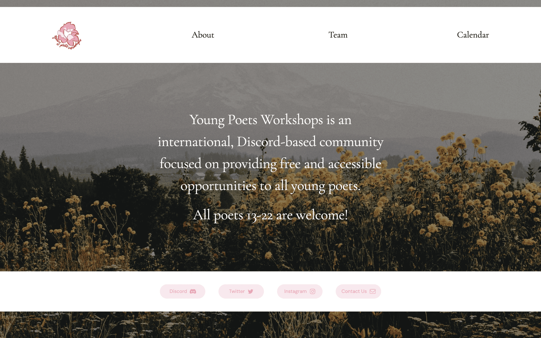
Oriignal website
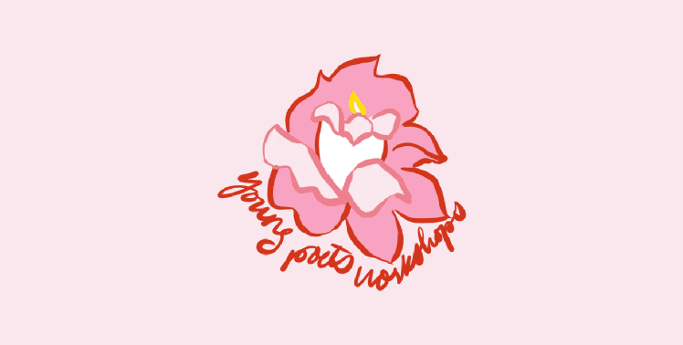
Existing logo
BRAINSTORMING
Inspiration and requests
Recurring themes the team liked included warm, playful serif fonts, muted pastels, and graphics mimicking real-life paper-based objects.
I provided the team with an extensive moodboard, as well as a site reference document that included a long list of websites and spaces for the team to share their thoughts.
Handwritten text
" I like the handwritten stuff at the bottom"
"It would be so cute if we each wrote something in our physical handwriting and then scanned it onto the webpage"
Pixel-y, video game aesthetic
"Again, really like the pixel-y doodles."
"I’m really liking this pixelated, video-gamey look especially with our youth focus."
Serif and typewriter font
"I absolutely love this design, but agree that it might not be functional for us. I think we could potentially take some design inspo from it though, such as [sic] the typewriter font"
"I think the combo of pastel colors + geometric buttons + typewriter font would really work for us"
"This particular serif font tickles my brain in a good way"
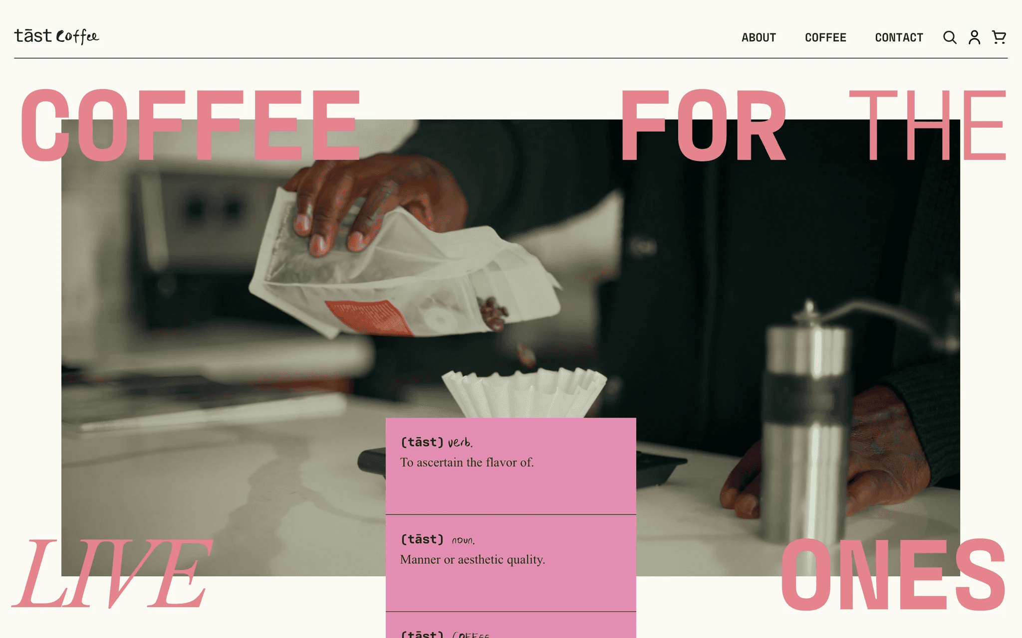
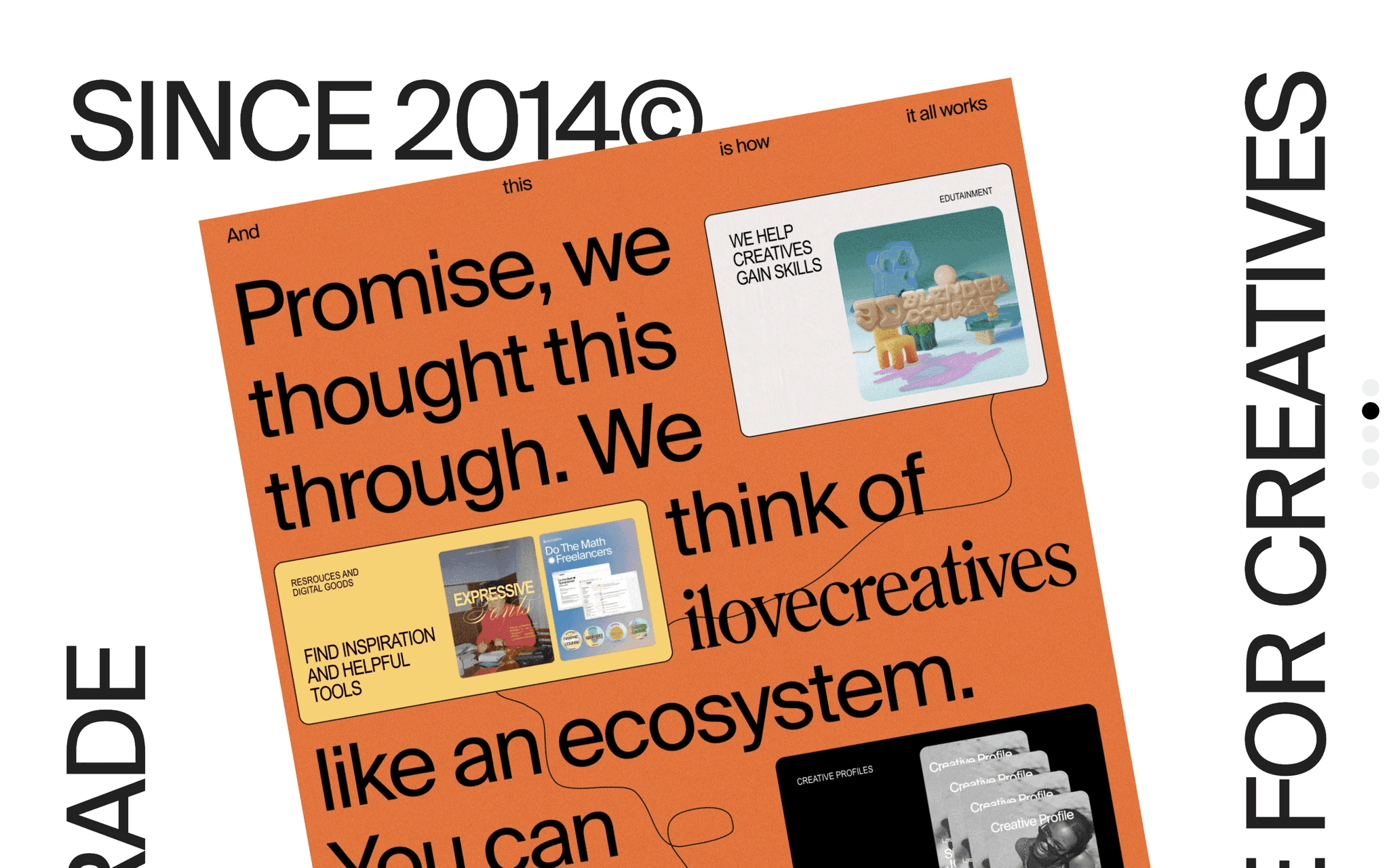
ilovecreatives.com / Major source of inspiration for its paper-based graphic elements
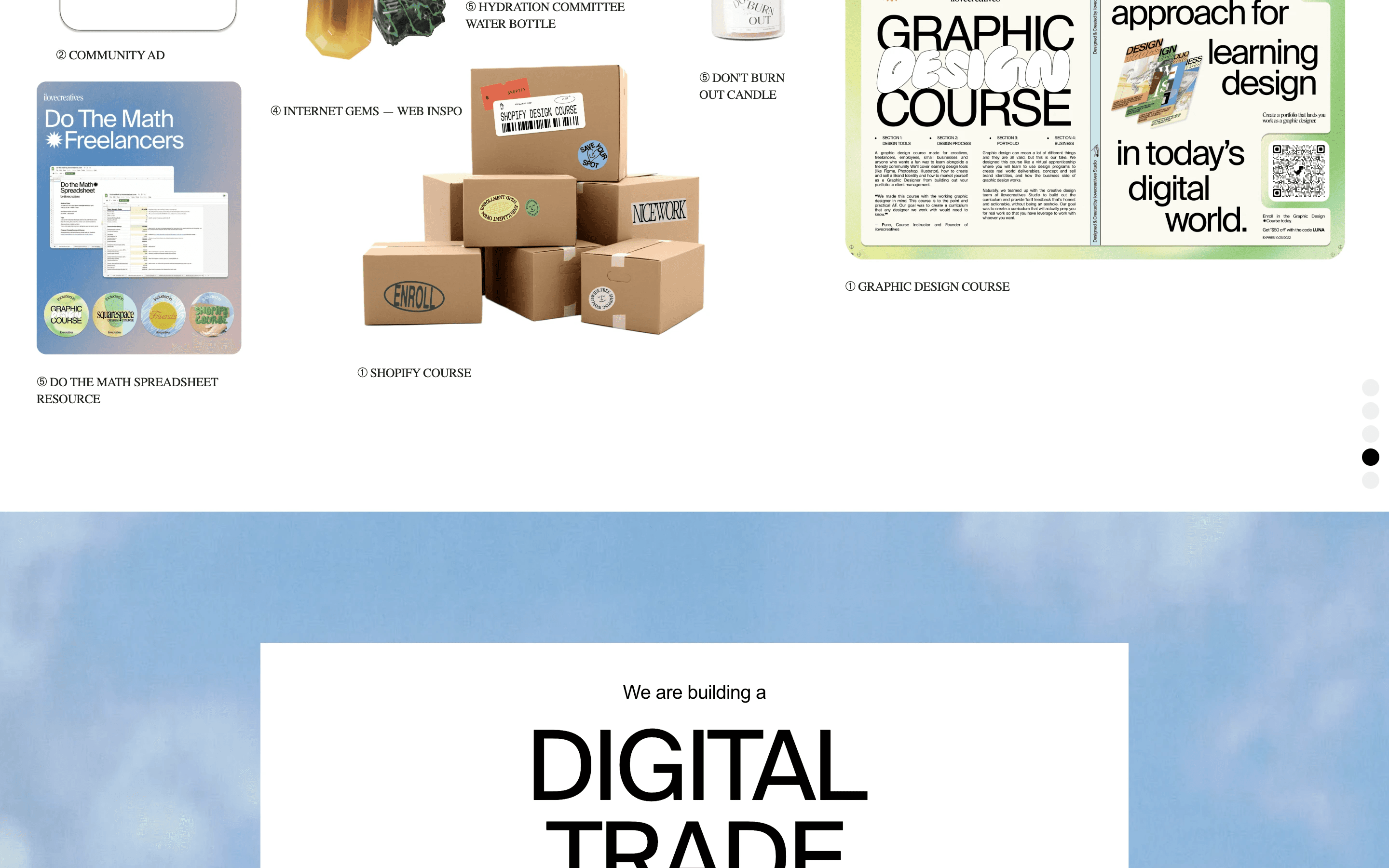
ilovecreatives.com / Major source of inspiration for its paper-based graphic elements
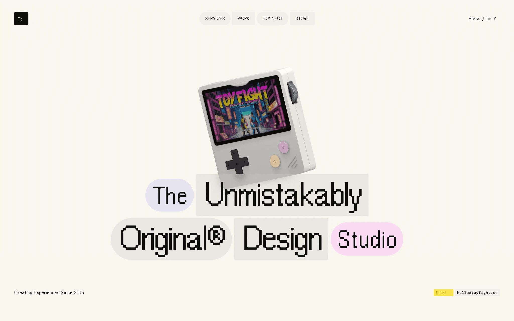
toyfight.co / Source of inspiration for its typewriter fonts
WEBSITE
Young Poets Workshops
Home
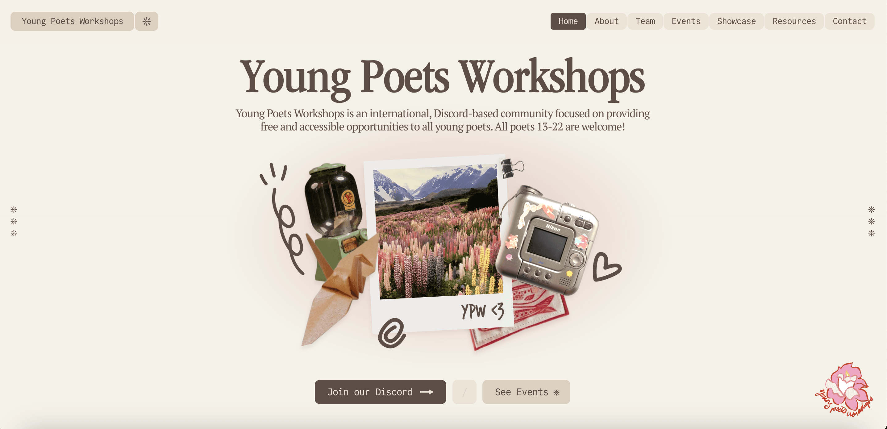
The home page was meant to provide a comprehensive introduction to YPW: it ended up including a hero, a overview section with YPW's 4 main concentrations, its latest event, relevant statistics, testimonials, and an ending CTA.
Home
About
The about page contained an interactive letter that, when clicked, opened up in an animation to reveal a letter written by the founders of YPW. The end of the letter also featured the founders' handwritten signatures that were then traced.
About
Showcase
The showcase page acted as a gallery featuring books written by YPW community members. It featured 3D books that rotate with the movements of your cursor, and included relevant information for each book. A snap scroll effect was also utilized, and a rotating question mark opened up an overlay containing information on the gallery's purposes, catalog, and submission process.
Showcase
Team
The team page featured a stylized form card with the names of the team and their handwritten signatures, also traced. When a certain member's card was hovered over, the team member's corresponding name was highlighted. The card featuring past staff was stylized with a black background.
Team
More pages
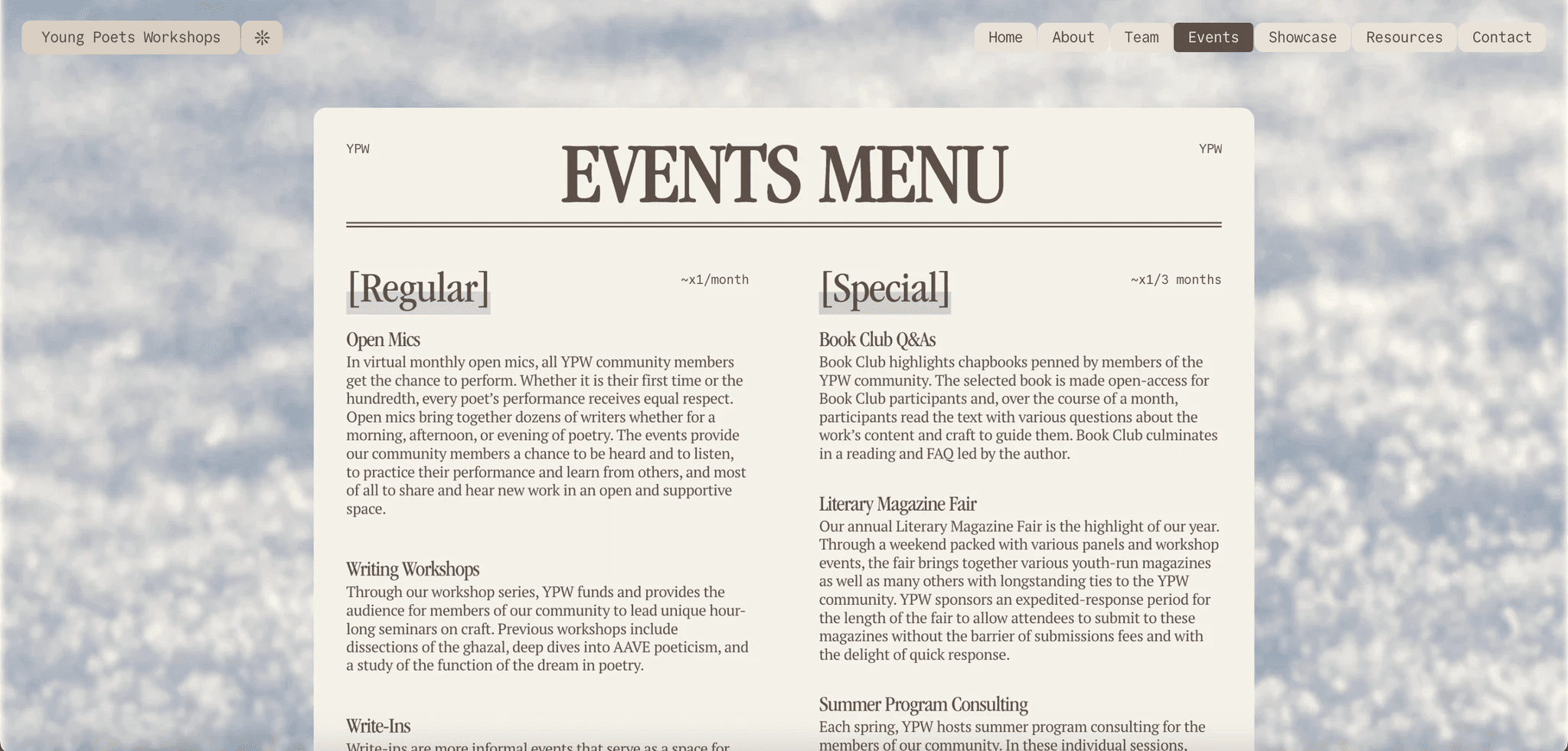
Events
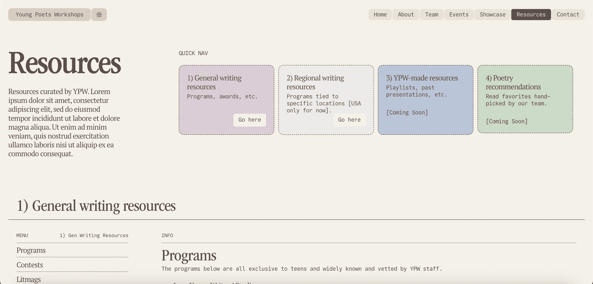
Resources
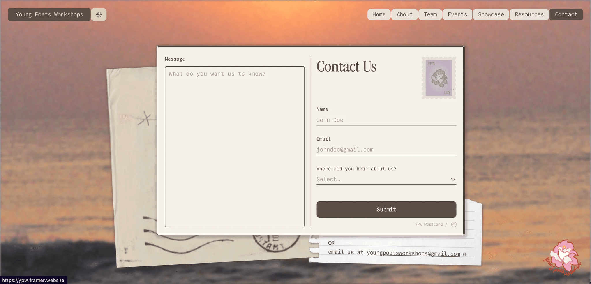
Contact
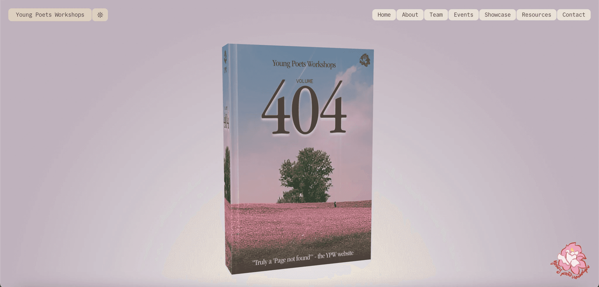
404